Midjourney Prompts for Wedding Invitations: Ready Pack
Here is the request almost everyone types first:
make a wedding invitation with flowersIt sounds reasonable, and it gives you a mess. Names written in made-up letters. A date that reads like a puzzle. Flowers crowding the exact spot where the names should go. Four results that look nothing alike, so there is nothing to compare.
The cure is not a longer sentence. It is a better order of steps. This guide builds one card in rounds, so you can see what each change fixes, and then hands you a kit for making the rest of the set.
Quick answer: ask Midjourney for decoration only. Name the flowers, the style and three colors, ask for an empty center, and keep every word out of the request. Type the names and date yourself in Canva.
When the art is ready for paper, our print guide covers upscaling and file sizes.
Why the first attempt fails
Four problems sit inside that one short sentence.
It asks for words. The tool draws letters as shapes, so spelling breaks. Two names and a date are exactly the kind of text it gets wrong.
It gives no style. “Flowers” could mean a photo, a cartoon or a painting. With no style, you get a different one in every result.
It names no colors. You will get whatever the tool likes, and it will probably clash with your venue and outfits.
It forgets the layout. Without instructions, the prettiest part lands in the middle, and the middle is where your names must go.
Each round below fixes one of these, in the order that matters most.
One more habit before you start: keep every request in a simple notes file. Copy each version, write down what changed, and mark the one you liked. After a few rounds you will have a small record of what works, and you will stop repeating mistakes.
Round 1: give the picture a job
The first fix is the cheapest. Tell the tool what the picture is for and where the empty space should be.
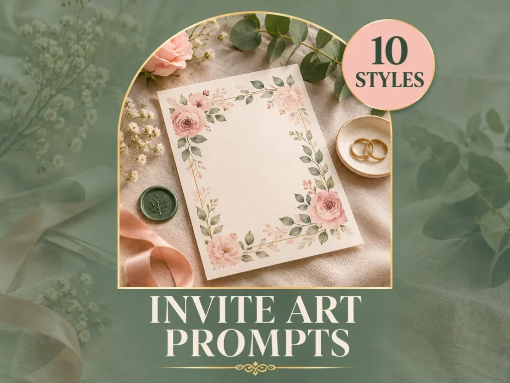
a floral border for a wedding card with a large empty center, watercolor peonies, ivory background --ar 5:7Two small changes did the work. “Border” and “large empty center” decide the layout. The ratio 5:7 matches a common 5 by 7 inch card, so you will not need to crop later.
Results will already look like cards. They will still have rough spots: stray shadows, odd letter shapes in the corners, and colors you did not choose.
Round 2: lock the colors and the style
Now add the details that make the card yours. Name the flowers, the style and exactly three colors, and use plain color names.
a loose watercolor border of blush peonies and sage leaves, soft romantic style, blush pink, sage green and ivory, large empty center, plain ivory paper background --ar 5:7 --no text, letters, people, shadowsThe new tail, “–no text, letters, people, shadows”, removes the four things that cause the most repair work. A short list works better than a long one, because a long list can start to confuse the result.
Notice the colors are named, not described. “Blush pink” is something you can match to a ribbon or an outfit. “Pretty pink” is not.
Round 3: control the edges
By now the card looks good but may feel crowded. Round 3 adds placement and a lower stylize value, which keeps the tool closer to your words and farther from its own taste.
a loose watercolor border of blush peonies and sage leaves, soft romantic style, flowers gathered in the top left and bottom right corners, delicate and airy, blush pink, sage green and ivory, large empty center, plain ivory paper background --ar 5:7 --s 50 --no text, letters, people, shadows, heavy shadingThe Midjourney docs explain every code in this line, and the behavior shifts between versions, so check there if a result looks different from what you expect.
Corner placement is a quiet trick. Flowers in two opposite corners leave more room for text than a full border, and the card looks lighter and more modern.
Run this version three or four times. Save the two you like best and keep the exact wording in a note. That note is your recipe, and the next round depends on it.
How to read the four results
Do not pick the prettiest one. Pick the most useful one. Hold each result against a simple list of questions and the choice gets easy.
Is the center really empty, or is there a faint pattern that will fight with text? Do the flowers stay inside the edges, or do they run off in a way that a printer might cut? Do the colors match the three you named? Is there any shape that looks like a letter?
Zoom in to full size and look at the petals and leaf edges. Soft, clean edges upscale well. Muddy, smeared areas turn into obvious blotches on paper.
Finally, shrink the picture to the size of a phone screen. A good card still looks balanced and calm when it is small, because many guests will first see it on a phone.
Round 4: match the rest of the set
A wedding needs more than one card. The easy way to keep everything matching is to keep the recipe from Round 3 and change only the shape and the placement.
Save the date. A tall card with flowers only along the bottom edge.
a loose watercolor garland of blush peonies and sage leaves along the bottom edge only, soft romantic style, blush pink, sage green and ivory, large empty space above, plain ivory paper background --ar 4:5 --s 50 --no text, letters, people, shadowsReply card. A small sprig in one corner so the card stays quiet and practical.
a single small sprig of blush peonies and sage leaves in the top left corner, loose watercolor, blush pink, sage green and ivory, mostly empty plain ivory paper background --ar 5:7 --s 50 --no text, letters, people, shadowsEnvelope lining. A seamless pattern that repeats without visible edges.
small watercolor blossoms and leaves, seamless repeating pattern, blush pink and sage green on ivory, delicate --tile --ar 1:1 --no text, peopleMonogram wreath. A circle with an empty middle for the couple’s initials.
a circular wreath of sage leaves and tiny blush blossoms in loose watercolor, empty round center, ivory background --ar 1:1 --no letters, text, people, shadowsIf you want a crisp monogram or crest, our logo prompts guide shows how to judge and clean a small mark so it stays sharp at any size.
Pause: questions people ask at this point
By Round 4, the same questions come up again and again. Here are the short answers.
Can Midjourney write the names and date on the card?
It can try, but spelling is unreliable. Make the art without text and add the words in Canva with a real font.
What size should the card be?
A common size is 5 by 7 inches. Ask your printer for their exact size and margin rules before you finish the design.
How do I keep a set of cards matching?
Reuse the same recipe, with the same flowers, colors and style in every request. Change only the shape and the placement.
Why does the art cover the middle of the card?
The request did not ask for an empty center. Add “large empty center” and a short list of things to leave out, then run it again.
Can I use the same art for a digital invite?
Yes. Export a tall version for stories and a feed version, and send a test message first, because messaging apps compress images.
Is it fine to sell templates made with AI art?
Often yes, but you must follow marketplace rules, state the AI help clearly, check your plan’s terms and use fonts that allow commercial use.
How many versions should I try?
Run each request a few times and compare. Keep the best three, show them to the family and choose together.
The mix-and-match kit
Once you understand the rounds, you do not need a long list of ready prompts. You need ingredients. Pick one item from each list below, put them into the formula, and you have a new card.
[motif] border, [style], [colors], [layout], plain [paper color] paper background --ar 5:7 --s 50 --no text, letters, people, shadowsMotifs
blush peonies, ranunculus, garden roses, eucalyptus and olive leaves, lavender sprigs, marigold garlands, paisley and vines, pressed wildflowers, a thin gold arch, art deco fans, tiny gold stars, a soft mountain sunriseStyles
loose watercolor, hand-painted gouache, thin line art, vintage engraving, minimalist brush stroke, art deco, ink wash, layered paper cutPalettes
blush pink, sage green and ivory | champagne, thin gold and ivory | burgundy, navy and gold | eucalyptus, white and soft gray | marigold, magenta and emerald | off-white and dusty blue | terracotta, sand and olive | lilac, cream and silverLayouts
border around a large empty center, flowers in two opposite corners, a single edge strip, an arch across the top only, a garland along the bottom only, a center wreath with an empty middleHere are three finished combinations to show how the pieces fit.
A garden afternoon.
eucalyptus and olive leaves border, loose watercolor, eucalyptus green, white and soft gray, flowers in two opposite corners, plain white paper background --ar 5:7 --s 50 --no text, letters, people, shadowsA mehndi night
Bright color and symmetry suit a festive evening.
marigold garlands and paisley border, hand-painted gouache, marigold, magenta and emerald, symmetrical border around a large empty center, plain cream paper background --ar 5:7 --s 50 --no text, letters, people, facesA winter evening
Deep color and thin metal lines look dressy under lamps.
art deco fans border, thin gold lines, burgundy, navy and gold, symmetrical border around a large empty center, plain deep navy background --ar 5:7 --s 50 --no text, letters, peopleKeep to one palette and one style for a whole set. Mixing three styles is the quickest way to make a wedding look unplanned.
When a result still goes wrong
Even a good recipe misfires sometimes. Change one thing at a time, so you know what helped.
If the art looks too busy, remove one motif and add the words “minimal” and “lots of empty space”. If the colors drift, repeat the three names at the start of the request as well as in the middle. If the border looks stiff and mechanical, swap “border” for “loose garland” or “scattered sprigs”.
If the edges look odd, lower the stylize value a little more and ask for a plain background again. If one result is almost right, make a fresh request with the same wording and a different ratio, and compare the two side by side.
Check the colors against real things
Colors on a glowing screen rarely match fabric or paper. Before you commit to a palette, hold a real ribbon, a flower or a swatch from the decorator next to your screen and compare. If the sage looks too gray or the blush looks too orange, adjust the color names in the request and run it again.
It also helps to ask the family what colors they associate with the day. A palette that feels right to everyone saves arguments later, and it makes the proofread much calmer because nobody is surprised by the printed result.
Write the three color names in your recipe note, along with the exact flowers. When the printer or the planner asks for the palette, you can answer in one line.
Round 5: add the words
This is where the picture becomes a card. Open a design at your final size in Canva, place the art as the background, and build the text on top. Our Canva guide shows how to place, align and layer text if you have never done it.
Keep the order of importance clear. The names are largest. The date is next, then the venue and the time. Reply details and dress code are smallest.
Wording follows a familiar pattern: a short line from the hosts, the invitation line, the couple’s names, the day and date, the venue, and a reply line with a number and a reply-by date. Guests know where to look, and that is comforting.
Many families write in two languages. If you add Urdu, test it first. Joined letters can break apart in some design tools, and a card with scrambled script is worse than a card without it. Use a font made for the script and print a small sample to check every word.
Leave generous space around the text block. Cards with a little more empty space than you think you need look calmer and more expensive, and they are easier to read from a distance on a busy table.
Use a script font for the names only. Everything else should be plain and readable. If flowers fight with the text, soften the art or place a pale box behind the words.
Round 6: print it, or send it
Most couples do both. Printed cards go to older relatives and close family. A phone version goes to everyone else.
A standard 5 by 7 inch card needs about 1500 by 2100 pixels at 300 DPI, plus a small extra margin around the edge called bleed, so the art reaches the trim line. Ask your printer for the exact numbers. Midjourney’s raw image is smaller than that, so upscale it first.
Paper changes the mood. Thick, matte, slightly textured paper feels premium and hides small flaws. Glossy paper makes colors pop but shows fingerprints. Ask for sample sheets and hold your printed test beside them. A soft pink can turn gray on rough stock.
Before you order, confirm that every font in the file allows commercial printing. Google Fonts lists the license for each family.
For phones, export a tall version at 1080 by 1920 pixels for stories and a 1080 by 1350 version for feeds. Send a test to yourself and zoom in, because messaging apps compress images.
One wedding, several events
Many weddings in Pakistan run over several days, with an event for each, such as a mehndi, a baraat and a walima. Guests may be invited to only some of them.
Give each event its own card, but keep one shared palette and one art style so the set still feels like one family. Change the accent color or the main flower per event, and make the event name and the time the clearest line on each card. That way no guest turns up on the wrong night.
The read-aloud pass
A card made this way has a different risk. The art is safe, but the words are typed by hand, and a typo on a wedding card is remembered longer than any flaw in a border.
Do one pass out loud. Read both names, the day, the date and the time. Say the address and the phone number. Then hand the card to two people who have not seen it and ask them to tell you when and where the wedding is. If they hesitate, simplify the layout.
Check the day against the date on a calendar. Check the venue against a map. Ask someone from each family to check the names, spelling and order.
Keep the final files in more than one place, with the date in each file name. Plans change, and a lost file the week before printing is a bad surprise.
Turning the skill into a small shop
Editable wedding templates are a popular digital product, because buyers can change the names and print them at home or at a local shop. Sell full sets in one palette, not single cards, and show them on a flat-lay or mockup so buyers can picture them.
Etsy asks you to be open about how an item was made, including any AI help. The Etsy standards page explains the current wording, and it is worth reading again every few months because the rules have changed more than once.
Good listings show the set in use. Add a photo of the printed card, a view of the editable text, and a clear list of what is included, such as sizes, file types and the number of pages. Say plainly what the buyer can change and what is fixed, so nobody is surprised after paying.
Include simple instructions for editing the text and printing at the right size, and tell buyers which fonts they need. Also read your Midjourney plan’s terms on commercial use before you sell anything.
The folder you should end up with
When everything is finished, your folder should look something like this. Clear names save hours when you need a fresh copy.
wedding-cards/ | art/ main-border-v3.png, save-the-date.png, reply-card.png, envelope-liner.png, wreath.png | canva/ main-card.pdf, details-card.pdf, reply-card.pdf | print/ main-card-5x7-300dpi.pdf, samples-photos/ | phone/ story-1080x1920.jpg, feed-1080x1350.jpg | notes/ recipe-round-3.txt, fonts-used.txtThe recipe note matters most. It lets you rebuild any card in the set, in the same style, in a few minutes, even months later.
If you plan to turn those files into a small shop, our guide to Etsy digital products explains what sells and how to set up the shop side.