Midjourney Prompts for Social Media Designs: A Weekly Set
One picture, five crops. That is the quiet problem with social media art. The same design gets squeezed into a square on a profile grid, stretched tall in a story, trimmed wide for a link preview, and covered by buttons on top. If you did not plan for that, the best part of your picture ends up under a thumb.
Midjourney is good at making the backgrounds and textures that sit behind your words, as long as you ask for the right shape and leave room for text. It is bad at spelling and bad at following your brand unless you tell it how.
This guide gives you a style card to keep everything consistent, a size map so you stop guessing ratios, and a full week of detailed prompts, one for each day, plus a way to make a month of posts in a single afternoon.
1. Pick the shape
Choose the ratio for where the post will live before you write anything.
2. Ask for background only
Describe color, texture and a clear empty area. Keep letters out.
3. Type on top
Add words, logos and faces in an editor, where you control them.
If you already have a brand mark, check it against our logo prompts advice first, because your colors and shapes will feed the style card below.
Make a style card once
The fastest way to ruin a feed is to let every post look like it came from a different person. The cure takes ten minutes. Write down a style card, and paste its words into every request.
A style card has four parts: three colors, three mood words, one art style and one list of things to never include. Here is a blank one you can copy:
STYLE CARD | colors: [color one], [color two], [color three] | mood: [word], [word], [word] | art style: [flat vector, paper layers, soft gradient or studio photo] | always add: soft grain, clean empty area for text | never add: text, letters, logos, peopleAnd here is the same card filled in for a calm, modern account that shares study tips:
STYLE CARD | colors: dusty rose, deep teal, warm cream | mood: calm, modern, friendly | art style: layered paper shapes with soft shadows | always add: subtle paper grain, clean empty area for text | never add: text, letters, logos, peopleNow turn the card into a tail you can paste at the end of any request:
layered paper shapes with soft shadows, palette of dusty rose, deep teal and warm cream, subtle paper grain, calm modern mood, clean empty area for text --no text, letters, logos, peopleEvery prompt in this guide uses that same pattern: a description of the scene, then the style words, then the limits. Swap in your own colors and the whole set becomes yours. The Midjourney docs explain each code at the end of a request, and they change between versions, so check there if something stops working.
The size map
Ratios look abstract until you see them side by side. Each box below is drawn in proportion, so you can picture where your art will live.
Typical pixel sizes are 1080 by 1080 for a square, 1080 by 1350 for a tall feed post, 1080 by 1920 for stories and reels, 1000 by 1500 for a pin, 1280 by 720 for a video thumbnail and about 1200 by 630 for a link preview. Platforms update their guidance, so confirm the current numbers on each one.
In Midjourney, you write the ratio with the ratio code. A tall post is 4:5, a story is 9:16, and a link banner is 191:100.
One rule saves the most trouble: keep the important part of the picture near the center. Profile grids crop posts, and stories hide the top and bottom edges behind buttons.
A week of posts, one prompt a day
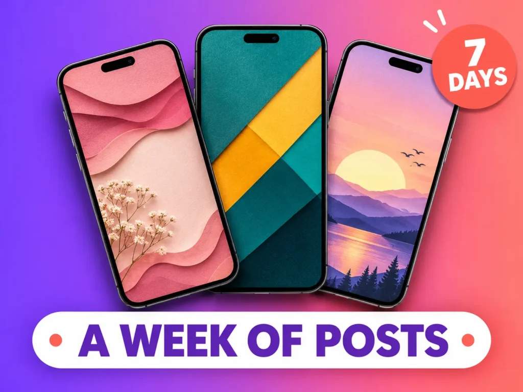
Here is a full week of backgrounds, each one tuned for a different job. Run each prompt a few times, pick the best of the four results and keep the exact wording for next month.
MON: Quote card
Calm and soft. Quote posts need a big empty area, so ask for one in the middle.
a soft abstract background for a motivational quote post, flowing translucent paper layers in dusty rose and warm cream, subtle grain, gentle depth, a calm empty area in the center for text, minimal, no objects, high resolution --ar 4:5 --no text, letters, people, logoTUE: Carousel cover
The cover decides whether anyone swipes. Use strong contrast and leave a band for the title.
a bold geometric cover background for a tutorial carousel, large overlapping circles and quarter arcs in deep teal, mustard and off-white, flat vector style, strong contrast, a clean empty band across the lower third for a title, no gradients --ar 4:5 --no text, letters, people, shadowsWED: Story backdrop
Stories carry stickers and text, so leave most of the picture quiet and keep the detail at the bottom.
a vertical story background of a sunrise over layered hills in peach, lavender and soft gold, painterly and dreamy, a calm sky area across the top two thirds left empty for text and stickers, simple rolling hills along the bottom third --ar 9:16 --no text, letters, people, logoTHU: Product spotlight
A clean stage for a product photo you add later. Keep the front center free.
a clean studio product backdrop, a smooth pastel mint podium and a soft arch shape against a warm beige wall, gentle window light with soft shadows, an empty center-front area for a product, premium minimal look, product photography style --ar 4:5 --no text, product, people, logoFRI: Highlight icons
Small icons in one matching style tidy up a profile. Generate the sheet once and crop each icon.
a set of six simple line icons for story highlight covers: a camera, a heart, a shopping bag, a star, a question mark and a gift, thin white line drawings centered on solid terracotta circles, consistent style and size, flat, evenly spaced in two rows --ar 3:2 --no text, letters, people, shadowsSAT: Announcement banner
Festive and loud, but still readable. A big empty middle holds the headline.
a festive announcement background with floating confetti shapes and soft glowing light in coral, violet and gold, joyful and energetic, a large empty central area for a headline, wide format --ar 16:9 --no text, letters, people, logoSUN: Reel cover
A tall cover with a bold split. The left side holds text and the right side leaves room for a subject cutout or a product.
a bright reel cover background with a strong diagonal split of electric blue and warm yellow, subtle halftone dots, high contrast, bold flat style, a large empty area on the left for text and a clear open area on the right for a subject, vertical composition --ar 9:16 --no text, letters, people, logoTreat the week as a starting kit, not a rule. If your account is about cooking, replace Monday’s quote card with a recipe card background, and keep the same structure and style words.
Notice that none of these ask for words, faces or logos. That is the point. You get clean surfaces, and you add everything that must be exact.
Beyond the feed: three more shapes
Posts are not the only place your designs show up. Three more shapes are worth having in your toolbox.
Pin backgrounds. Tall and bright, with a clear upper third for a title. Pins last for months, so make them tidy.
a tall pin background of soft watercolor washes in sage green, peach and cream, light paper texture, a clear empty upper third for a title and gentle floral edges along the bottom, calm and inviting --ar 2:3 --no text, letters, people, logoLink banners. A wide, quiet image for professional pages and link previews. Keep the details at the edges.
a wide professional banner background of flowing navy and teal ribbons with fine gold line accents, smooth and modern, all detail near the left and right edges, a calm open center for a headline, subtle texture --ar 191:100 --no text, letters, people, logoVideo thumbnails. Thumbnails live or die by contrast. Ask for a simple high-contrast scene with clear space for a title and a subject. The YouTube Help pages explain the current rules for custom thumbnails.
a high-contrast thumbnail background with a bright orange to deep purple gradient, bold diagonal light rays and a subtle starburst, clean open area on the left for a title and a clear spot on the right for a subject, energetic flat style --ar 16:9 --no text, letters, people, logoPut the words on top
The background is only half of a post. Open an editor, place the art and add the text yourself. Layers, alignment and spacing are the three skills that matter most here, and each takes only a little practice to learn.
Four habits make the text read well on a busy phone screen.
- Contrast first. If the background is light, use dark text, and the other way round. If text still fights the art, place a soft shape behind it.
- Three sizes, no more. One big headline, one smaller line and one tiny detail. Anything else becomes clutter.
- Stay in the safe zone. Keep text inside the middle of the picture. On a story, avoid the top and bottom strips where the app’s buttons sit.
- Two fonts at most. One for headlines and one for small text. Free options are easy to find, but check each font’s license.
Before you post, shrink the design to the size of a phone screen and look at it at arm’s length. If you cannot read the headline in two seconds, make it bigger or shorter.
A month of posts in one afternoon
Batching is what makes this approach worth the effort. Making ten posts in ten sittings takes days. Making thirty posts in one sitting takes a few hours.
- Write the list first. Decide thirty post topics, so you know how many of each kind you need.
- Group by shape. Make all the tall posts together, then all the stories. You change the ratio once instead of thirty times.
- Run each prompt twice. Save the best result and a runner-up, so a weak result never stops the day.
- Name every file. Use a clear pattern such as “mon-quote-rose-01”, so you can find things later.
- Build the text in one pass. Add words to all backgrounds in your editor in a second block of work. Our Canva guide explains layers, alignment and spacing in plain steps.
- Schedule everything. Use the platform’s scheduler, or a free planner, so posts go out on their own.
When one design performs well, keep its exact prompt in a note and reuse it every few weeks with fresh text. A tested background beats a new experiment most of the time.
Seasonal swaps without losing the brand
Your style card does not need to change when the season does. Keep the art style and the empty-area rule, and swap only the palette for a few weeks. A spring set can lean into blush and sage. A winter set can use navy and silver. A festive set can add gold and emerald.
blush pink, sage green and cream | navy, silver and ice blue | emerald, gold and cream | terracotta, sand and olive | lilac, white and soft gray | coral, teal and sunny yellowBecause the style words stay fixed, followers still recognize your posts, even as the colors shift.
Check, test and publish
Before anything goes live, run three small checks.
The phone check. View the finished design on a real phone. Colors that looked fine on a monitor can feel harsh on a small screen.
The consistency check. Place five recent designs side by side. Do they look like one account? If one stands out, it probably broke the style card.
The two-cover test. For carousel covers and thumbnails, make two versions with different colors or layouts. Post them on different days and compare how people react. Small tests teach you what your audience actually responds to.
Export at the full size for the platform, and keep file sizes reasonable so images load quickly. If your text uses free fonts, check the license for each one before you sell or publish designs, and keep a note of the fonts you used. Google Fonts lists the license for every family.
Make the profile grid feel planned
Followers judge an account in a few seconds, and they judge it by the grid. A feed that looks planned feels trustworthy, even if the posts are simple.
Think in rhythm. Alternate busy posts with quiet ones. A bright carousel cover can sit next to a calm quote card, and the colors from your style card tie them together.
Use Friday’s icon set for story highlights, so the row at the top of the profile matches the posts below it. Pick one color from the card for all icon circles and the profile will look finished.
Avoid repeating the exact same layout many times in a row. A background with the empty area in the center, followed by one with the empty area on the left, then one with a band at the bottom, keeps the feed lively without breaking the style.
Keep text sizes consistent between posts too. If headlines jump from small to huge, the grid looks messy, even when the art is beautiful.
Read the results, then repeat the winners
After two weeks of posting, look at which designs did best. Check saves, shares and swipes through a carousel, not only likes, because those show real interest.
Next to each result, write down the prompt that made the background. Patterns appear quickly. Maybe pastel posts earn more saves, or maybe your bold covers get more swipes. Whatever the pattern, it is your account’s taste, and it is worth following.
Keep a note called “winners” with the exact wording of the best prompts. Reuse them with new text every few weeks. Retire the ones that never worked, and test one new idea per week so the feed never goes stale.
Do not read too much into one post. Timing, topic and luck all play a part. Look for trends across five or six posts before you change your style.
Turn the skill into income
Once you can produce a coherent week of posts, you have a skill people pay for. Small businesses often know they need regular posts but have no time or budget for a studio.
One path is selling packs of ready backgrounds and editable templates as digital downloads. Our guide to Etsy digital products covers what sells and how to set up a shop.
Another path is offering a monthly service, where you deliver a set of designs each week. Start with a small sample pack for a local shop, show them the before and after, and price by the number of posts.
A good starter offer is twelve posts and four stories per month, in one palette, delivered as ready-to-post files plus the editable files.
Rules that protect your account
A few habits keep you out of trouble.
Never ask for real people, famous characters or brand logos in your art. They invite copyright claims, and accounts lose reach when posts are reported.
Platforms are adding labels for AI-made images, especially realistic ones. Read the current policy for each platform you use, and label content when asked.
If you make designs for clients, read your Midjourney plan’s terms on commercial use, and tell clients that AI helped. Honest work leads to repeat clients.
Also avoid copying another account’s look too closely. Borrowing a general idea, such as a calm pastel feed, is normal. Copying a distinctive layout almost line for line can earn complaints and costs you trust with your own audience.
Finally, keep your original prompts and files. If a platform ever questions a design, you can show how it was made.
Frequently Asked Questions
Can Midjourney write the words on my post?
It tries, but the spelling often breaks and letters bend into odd shapes. Make the background without text, then type the words yourself in an editor.
Which ratio is safest for the feed?
A tall 4:5 gives you the most space on a phone without being cropped away. Keep the important part of the picture near the center, because profile grids trim the edges.
How many colors should a post use?
Three is a good limit. Fewer colors look confident, keep the feed matching and make text easier to read.
Should I ask for people in the picture?
Usually not. Hands and faces often come out wrong, and a new face in every post confuses followers. Add a real photo or a simple cutout later if you need a person.
How do I keep every post matching?
Write a style card, paste the same style words after every request, and keep the same version of the tool. Place five recent designs side by side before you post to check they look like one account.
How many posts do I need each week?
Start with three to five. A steady rhythm you can keep for months beats a burst of daily posts that stops after two weeks.
Can I sell designs I make this way?
Often yes, but read your plan’s terms on commercial use, follow each marketplace’s rules and say clearly that AI helped. Never sell designs that include real people, famous characters or brand logos.
Do I need to label AI art on the platform?
Some platforms ask for labels on realistic images, and the rules keep changing. Check the current policy for each platform you use before you post.
Start small this week
You do not need a perfect plan. Make a style card today. Run Monday’s prompt tomorrow. By the end of the week, you will have seven designs that match, and you will know which parts of the process you enjoy.
Keep notes, adjust the words that did not work and repeat. When you are ready to offer this to others, our guide to Fiverr gig setup shows how to present the service so buyers can find you.