Midjourney Prompts for Logo Design: Brand-Ready Guide
Picture a small shop owner who needs a logo by Friday. Quotes from designers cost more than the first month’s rent, so a quick try with AI looks like a sensible move. Three hours later there are sixty glossy images on the screen, and not one of them looks right on a signboard.
The problem is that a logo is a different job from a picture. It has to stay readable on a phone screen, a shop sign and a rubber stamp. Midjourney can help with that work, but only when you ask for it in the right way.
This guide shows how to brief the tool, which requests suit which kind of mark, how to pick a winner, and how to turn the result into files you can really use. It is written for beginners, so every step uses simple, mostly free tools.
Quick answer: Ask for a simple symbol, not a scene. Say which kind of mark you want, name two colors at most, request a flat style on a plain white background, and keep letters out of the request. Pick the clearest result, then clean it up and add the business name yourself in Canva.
If you also plan to put the mark on shirts or mugs, our product prompts guide covers file sizes and print rules, so read it once your symbol is ready.
A logo is not an illustration
An illustration is allowed to be rich. A logo is not. It earns its place by being easy to see, easy to remember and easy to copy onto almost anything.
Think about the marks you recognize without effort. Most are built from two or three shapes. They use one or two colors. They still work when the picture is the size of your thumbnail.
So the goal is not “beautiful”. The goal is “clear at a glance”. Keep that sentence in your head every time you look at a result, because Midjourney leans toward beautiful and will happily bury a good idea under shading and detail.
Here is what a working logo needs:
- Few shapes. If you cannot describe it in one breath, it is too busy.
- Flat color. Gradients and shadows break when printed on a stamp or embroidered on a cap.
- Room to breathe. Empty space around the mark makes it look confident.
- One clear idea. A fox, a wheat stalk, a compass. Not a fox holding a compass in a wheat field.
Write a brief before you write a prompt
Good logos start on paper, not in the prompt box. Spend ten minutes answering five questions, and the prompt almost writes itself.
- What does the business do? One plain sentence, such as “home tutoring for matric students”.
- Who is it for? Parents, gamers, brides, farmers. The audience decides the mood.
- What should people feel? Trust, fun, speed, calm, luxury. Pick one or two.
- Which colors fit? Choose two at most. Blue suggests trust, green suggests growth, orange feels friendly, black feels premium.
- Where will it appear? The profile picture is tiny and round. The shop sign is wide. A stamp has one color.
The last question matters most and gets skipped most often. A mark that looks fine on a laptop can turn into a smudge inside a round social media icon.
Worth knowing: Write down three words you do not want, such as “cheap”, “busy” or “childish”. Looking at those words later helps you reject results quickly instead of falling for a pretty one that sends the wrong message.
The six kinds of logo, and when each one fits
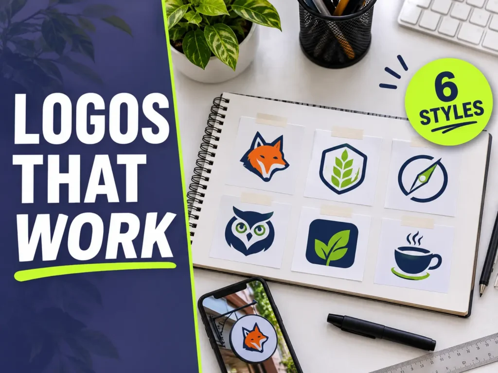
Naming the kind of mark you want gives Midjourney a strong hint. Here is a simple map:
| Type | What it looks like | Best for |
| Symbol | A simple icon with no words | Apps, channels, profile pictures |
| Emblem | A badge or seal with a border | Bakeries, cafes, local shops |
| Mascot | A friendly character | Kids’ brands, study channels, games |
| Abstract mark | Geometric shapes with no literal meaning | Tech, finance, consulting |
| Line icon | One thin outline | Studios, boutiques, minimal brands |
| Lockup | Icon with space for the name beside it | Signs, letterheads, websites |
If you are unsure, start with a symbol. It is the easiest to judge, the easiest to fix and the easiest to place inside a lockup later.
Parameters that matter for marks
Parameters are the short codes at the end of a request. The Midjourney docs explain all of them, and they change as new versions arrive, so check there when something stops working.
For logos, these few do most of the work:
- –ar 1:1 gives a square canvas, which suits most symbols and profile pictures.
- –ar 3:1 gives a wide canvas for a lockup, with room for a name.
- –no removes trouble makers. A short list such as text, gradients, shadows works well.
- –stylize set low keeps the result plain and literal. Set high, it adds decoration you do not want.
- –style raw reduces the built-in polish, which helps when results look too fancy.
Ten requests to copy and adapt
Each request below uses a made-up business so you can see how the pieces fit. Swap the subject and colors for your own, and keep the structure. Run each one a few times and compare the four results side by side.
1. Simple symbol
The safest place to start. One animal, two colors, plenty of space.
a simple fox head icon for a tutoring center logo, minimalist vector mark, geometric shapes, two colors navy and amber, flat, centered on a plain white background with lots of empty space --ar 1:1 --no text, gradients, shadows, mockup2. Round emblem
Badges feel traditional and trustworthy, so they suit food and local services.
a circular emblem logo for a neighborhood bakery, wheat stalk and rising sun, thick clean outlines, vintage stamp style, one color dark brown on cream, plain background --ar 1:1 --no text, photo, gradients3. Friendly mascot
Mascots stay in memory. Keep the shapes chunky so the face still reads when small.
a friendly owl mascot logo for a study channel, bold outlines, flat colors, simple shapes, front view, sticker style, plain white background --ar 1:1 --no text, shadows, scenery4. Abstract mark
Abstract marks suit businesses that sell something you cannot draw, such as software or advice.
abstract logo mark for a software startup, interlocking circles forming a hexagon, modern geometric style, single teal color, flat vector, plain white background --ar 1:1 --no text, gradients, 3d5. Line icon
One thin line looks calm and clever. It also converts to a vector very cleanly.
one continuous line drawing of a coffee cup with rising steam, minimalist logo icon, single black line, centered, plain white background --ar 1:1 --no color fill, text, shadows6. Negative space
Here the empty part of the shape forms a second picture. Results vary a lot, so run it several times.
a logo mark where the shape of a mountain forms the negative space of a bird in flight, black on white, minimalist, high contrast, flat --ar 1:1 --no text, gradients7. Rounded badge with a symbol
A container shape gives the symbol a neat edge, which helps on social media profile photos.
a rounded square badge logo with a bold abstract leaf symbol, flat vector, forest green and cream, clean edges, centered --ar 1:1 --no text, letters, shadows8. Hand-drawn feel
Good for repair shops, studios and craft brands that want a warm, human look.
a hand-drawn logo icon of a bicycle and a heart for a repair shop, ink sketch style, black on white, slightly rough lines, simple --ar 1:1 --no text, color, shadows9. Retro stripes
Three simple stripes and a limited palette give a clothing brand an instant personality.
a retro 1970s sunset stripes logo mark for a clothing brand, three horizontal stripes in orange, mustard and brown, bold simple shapes, flat, plain white background --ar 1:1 --no text, gradients10. Lockup with space for a name
This one leaves the right side empty on purpose, so you can add the business name in Canva.
a simple compass icon on the left with empty space on the right, flat vector logo concept, navy and gold, wide composition --ar 3:1 --no text, shadowsWhy the letters look wrong, and what to do
Image models draw letters as shapes, not as spelling. Names often come out with extra strokes, missing characters or twisted forms. Urdu and Arabic script are even harder, so do not trust them with a generator.
The fix is simple. Leave words out of the request and type them yourself. Free tools such as Canva basics are enough for this, and our beginner guide shows how to place text next to an icon and keep the spacing tidy.
Choose the font with the same care as the symbol. A thin, elegant font beside a chunky mascot looks mismatched. Round fonts suit friendly marks. Clean sans-serif fonts suit modern marks. Serif fonts suit older, traditional brands.
Use one font only. Two is the limit, and the second should be a quiet partner for a small tagline.
Pick the winner with a six-point scorecard
When you see forty options, taste will fool you. Use the same tests on every candidate and let the numbers decide.
- The thumbnail test. Shrink it to about the size of a fingernail. Can you still tell what it is?
- The squint test. Blur your eyes. A good mark leaves a clear shape behind.
- The black-and-white test. Convert it to a single color. If the idea vanishes, it was relying on color.
- The distance test. Look at it from across the room. Details should disappear and the main shape should stay.
- The difference test. Does it look like any famous brand? If a friend says “that reminds me of…”, drop it.
- The story test. Can you explain in one sentence why this mark fits the business?
It also helps to sleep on the decision. Look at your top three the next morning with fresh eyes. The one that still feels clear after a night away from the screen is usually the right one, and a mark you still like after a full day will probably keep working for years.
Give each candidate a score out of six. Anything under five goes in the bin. Do this before you show the mark to anyone, because friends and family tend to choose the busiest one.
Turn the picture into real files
The image from Midjourney is a flat picture made of pixels. A logo needs more than that. It needs sharp edges at any size, so the final set should include a vector file.
Here is a beginner-friendly path:
- Upscale first. Make the picture larger so the edges are smooth before you trace it.
- Trace to a vector. The free Inkscape editor can turn a simple picture into shapes. Marks with flat colors trace best, which is another reason to avoid gradients.
- Clean the shapes. Delete stray dots, smooth wobbly curves and merge pieces that should be one.
- Make color versions. Save a full-color version, a black version, a white version for dark backgrounds, and a single-color version for stamps.
- Add the name. Place the text in your chosen font and save a version with the icon above the name and a version with the icon beside it.
- Export the set. Keep an SVG vector file, a transparent PNG, and a small square version for profile pictures and website icons.
Reality check: Tracing is where weak results show up. A mark that looked fine as a picture can turn into a pile of tiny shapes. If the trace looks messy, go back and generate a simpler version instead of repairing a complicated one.
Test the final files in the places they will live. Paste the icon into a round profile frame, place it on a dark page, and print it once on ordinary paper at business-card size. Problems that hide on a bright screen show up fast on paper.
Store everything in one folder with clear names, such as “brand-icon-navy.svg” and “brand-lockup-white.png”. Six months from now you will thank yourself.
Check rights and originality before you commit
This is the part many beginners skip, and it is the part that causes the most pain later. Three checks protect you.
First, look for lookalikes. Upload your favorite mark to a reverse image search tool and look at the results. Then search your business category for similar marks. If something is close, change yours.
Second, understand ownership. In some countries, work made entirely by AI may not receive normal copyright protection. The US Copyright Office publishes guidance on this, and the rules differ from country to country. Adding real human work, such as your own edits, layout and lettering, strengthens your position.
Third, think about trademarks. If the logo is for a real business, ask whether the name and mark can be registered. In Pakistan that means checking with the Intellectual Property Organization before you spend money on signs and packaging.
Also read the commercial terms of your Midjourney plan. They decide whether you can use results for business, and they can depend on the size of your company.
Skip this: Never ask for a logo “in the style of” a famous brand, or for a famous character. It invites copying, and a copied mark is the fastest way to lose a client or get a page taken down.
Using the skill for work
Once you can produce clean marks, the skill can serve you in three ways.
For your own projects. Your blog, channel or shop needs one anyway, and doing it yourself saves real money at the start.
For clients. Many small businesses need a simple mark and cannot afford a studio. Be honest that AI helped, show two or three rounds of options, and deliver the full file set described above. Clients pay for the finished, usable files and for your judgment about which option works, not for the generation itself.
For templates. Ready-made logo packs with editable text can sell as digital downloads. Our guide to Etsy digital products explains what sells and how to set up the shop side. Remember that marketplaces ask you to describe how an item was made, so state the AI help clearly.
Whichever route you choose, build a small portfolio first. Five good marks for invented businesses, each shown on a sign, a cup and a phone screen, will do more for you than a long list of promises.
Mistakes that cost the most time
- Asking for a logo with the business name inside the prompt, then fighting broken spelling.
- Choosing the most detailed result because it looks impressive on a big screen.
- Using four or five colors, then discovering the stamp version has none of them.
- Skipping the vector step, so the mark turns blurry on a banner.
- Showing a client forty options. Three well-chosen ones get a faster, happier answer.
- Never testing the mark small, in black and white, or on a dark background.
A weekend plan for your first mark
- Saturday morning. Write the brief. Answer the five questions and list three words to avoid.
- Saturday afternoon. Run three kinds of mark, a symbol, an emblem and an abstract mark. Save the best two of each.
- Saturday evening. Score every candidate with the six tests and keep the top three.
- Sunday morning. Trace the winner, clean the shapes and make the four color versions.
- Sunday afternoon. Add the name, test small and large, and check for lookalikes.
- Sunday evening. Export the file set and put it in a clearly named folder.
Questions Beginners Ask
Can Midjourney write my business name in the logo?
It can try, but the spelling is unreliable. Generate the symbol alone and add the name in Canva or another editor with a real font.
What shape should the image be?
Square works for most symbols and profile pictures. Use a wide shape for a lockup where the name sits beside the icon.
How many colors should a logo use?
One or two is ideal. Fewer colors print better, cost less on stamps and merchandise, and look more confident.
Do I really need a vector file?
Yes, if the mark will appear on signs, banners or clothing. A vector scales to any size without blur, while a normal picture does not.
Can I sell logos made with Midjourney?
Often yes, but check your plan’s terms, be open with clients about the AI help, and deliver original, checked work. Rules about ownership differ between countries.
Why do my results look too fancy?
Lower the stylize value, add “flat vector, minimalist” to the request, and list shadows, gradients and 3d in the exclusion list.
Is it safe to use a result as it comes?
Rarely. Always check for lookalikes, clean the shapes and test the mark small, in one color and on dark backgrounds before you commit to it.
Where to go next
A strong logo comes from a clear brief, a handful of simple requests and a strict eye when you choose. The tool supplies the ideas. You supply the judgment, and that judgment is the part clients and customers actually pay for.
Results change between Midjourney versions, so save your best requests in a note and update them over time. When you feel ready to offer this as a service, our guide to Fiverr gig setup shows how to present it so buyers can find you.